Hey bloggers! I'm so sorry I haven't been posting since April but I have good reasons! I have gotten a job at a bakery and have been very busy with decorating cakes!! As soon as I can I will post some pictures of my cakes :)
Until then - Rachel.

Rachel Milak - Graphic Designer
Tuesday 19 June 2012
Monday 23 April 2012
"Summer Vacation"
Hey bloggers! So I am officially on summer vacation for a few weeks - watch out for new art work and posts in the next few weeks :)
Rach
Rach
Wednesday 11 April 2012
Illustrator Fun!

Hey Bloggers!
So I finally had some free time to really explore some more of adobe illustrator and ended up creating this! I think it looks pretty sweet considering I made it by accidentally clicking the wrong button. I love a happy accident! Try something new on illustrator - you never know what you may come up with :)
Happy Blogging!
Rachel
Tuesday 27 March 2012
The Factory - Hamilton, ON
Hey Bloggers!
So I don't think I ever introduced who I am. My name is Rachel Milak and I am a designer in Hamilton, ON. Hamilton is a real up and coming area for designers - from illustrators to media designers. Today I traveled down James St. North and came upon a few amazing places any designer or art lover should check out! The Factory was my favourite of all!
"The Factory: Hamilton Media Arts Centre is a not-for-profit artist-driven resource centre dedicated to the production and promotion of creatively diverse forms of independent films, videos, and other streaming multimedia art forms. The mission of The Factory is to develop and support a vibrant, sustainable, creative, and diverse community of Members and non-Members within Hamilton and its surrounding region, who are involved or interested in the Art, the Craft and the Technologies of, but not limited to the motion picture media. The Factory exists to provide access to facilities, equipment, peer resources and educational initiatives to the community of time-based visual artists, as well as to the community at large. To encourage the development and appreciation of all related visual art forms through an ongoing program of screening and events." - http://www.hamiltonmediaarts.com/whoweare.htm
While I was at The Factory I got a chance to speak with Cheryl Blankeney and I found out some really interesting things - not only about the company itself - but about how this company influenced Hamilton art lovers.
The Factory is a great place to go if you are interested in films. The Factory helps provide people with the equipment they need at reasonable prices - and helps you understand how to use them in the most effective way possible with sessions. To use there products you can purchase a membership (students too) at very reasonable prices.
The factory has some really interesting workshops for any film marker in the business if your the director, screen writer or enjoy every aspect. Cheryl told me about this cool 4 week workshop. Basically the take a one page script and break it into a story board, on the second weekend they figure of the camera, lights, etc. On the third weekend you actually make the film. On this week you do all the jobs - camera, camera assist - etc. So the cool thing is - you go in with a number of people making their own film - but using the same script. Each movie comes out differently because each person got to direct it.
The Factory has been in business since 2004 and recently moved into their new home at 228 James St North, Hamilton, ON - definitely a must see!
So heres the sad news about The Factory. The were robbed not to long ago and lost a lot of equipment. If anyone reading knows about this equipment - you know it isn't cheap. So after all the clean up and heartache had passed on as much as possible - another hard hit came there way. The money they got wasn't fully enough to get everything back after HST. So news spread around and Gallery 205 was outraged at how much this was all costing The Factory so they decided to take action.
The gallery gave The Factory 3 rooms to throw a fundraiser in. The fundraiser is April 29th, 2012 from 6pm - whenever, with many local bands all donating their time for supporting The Factory.
I highly suggest taking a trip down to talk to Cherly Blakeney about The Factory - she's a true expert!

Cheryl Blakeney - Arts Administrator
infor@factorymedia.ca

Monday 19 March 2012
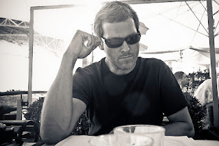
"Shades"
Hey Bloggers!
So I found another word of the week and instantly got inspired! The word is "Shades". Since this beautiful weather has drawn us all outside, what better time then to pull out your shades and be in the sun!

This is an image by Al Parker and this image inspired me to try something I haven't done before. I love how you have a realistic image of a woman in the background but then some fun vector drawn images to finish the body and hair. I liked how you can incorporate a very bold real image but use drawn images to bring it all together.

How I did it !


So I found another word of the week and instantly got inspired! The word is "Shades". Since this beautiful weather has drawn us all outside, what better time then to pull out your shades and be in the sun!
Some other inspiration!

This is an image by Al Parker and this image inspired me to try something I haven't done before. I love how you have a realistic image of a woman in the background but then some fun vector drawn images to finish the body and hair. I liked how you can incorporate a very bold real image but use drawn images to bring it all together.
Sketches

As for my sketches, I thought about maybe doing a cut out of sunglasses, a close up on a face with sun glasses on, or doing a full person.
In the end I decided to go with the actual advertisement with a person in it. I thought it would make it really interesting and to the point.
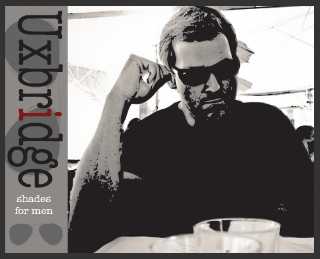
In this idea I decided to try a knock out. I took an image and used it for the background but did a black knock out for the body. Its hard to explain in text - so I will show you.
How I did it !
First I found an image I liked and made a copy of it. Next I did a live trace and turned it into a black and white logo. After that I took out many of the extra details in the face and background.

Next I lined up the knock out with the background to create the mysterious look. I like this because it uses a realistic approach but adds some modern feel to it.

Then I started on the creator of this brand. I couldn't think of a brand name so I went to a map and searched out an interesting name that related to shades. While I was looking up that I thought about a logo and decided to go with a simple pair or sunglasses.

Finally I found Uxbridge and thought this worked and sounded appealing. This name I believe works because on sunglasses, the piece that sits on your nose is called the bridge. I added the red colour to make it stand out and have some visual difference.

In the end I added "shades for men" for a tag line and one more pair of glasses.
Hope you enjoyed my process and maybe will go out and by some shades to!
Rachel
Tuesday 13 March 2012
Emotional Labour - What is it??
" What is emotional Labour? It's difficult work that other people don't feel like doing" - Seth Gordin
Hey Bloggers, Im writing today to talk to you about Emotional Labour and what it means - not only in theory - but what it means to me as well.
When designers break into the business you never fully understand how much labour is involved just to get started. Its time consuming, tiring, and very scary. To be a great designer you have to put yourselves out there - all of yourself- and show what your really capable of. There is a great pod cast by Seth Gordin about his views on what emotional labour is. ( I fully suggest listening to it - it has some great tips: http://www.cbc.ca/spark/2010/01/spark-97-january-3-5-2010/) Seth talks about how you have to be the person that wants attention and to be noticed, and to someone like me, its a scary thought. Were taught at a young age that being selfish isn't a good trait to have - but in the graphics world you need to have an attitude like that. Its not really about being selfish - but about having the quality of wanting to be known and remembered.
" The most precious thing to have is attention" - Seth Gordin
In the graphics world I found out that to get attention you have to really go out on a limb and go viral. You put that emotional labour into making something of yourself. You create blogs, flicker accounts, google +, twitter, facebook and many more websites to get your name out there. When I first heard of this it made me wonder, "well how will anyone actually find me? I've never done anything before." I realized that once one person see's what you can do - they share it - anyone else who see's it may like it and share it as well - and the chain keeps moving. Now this isn't only for graphics - anyone who just thinks "wow thats cool" can share it too. By posting what you do - I found out that people in other countries have seen what I am capable of. This whole network is all about emotional labour. Putting in that extra 10 minuets of your day, even when you really don't want to, to (not really brag) but to say "hey, what do you think" can go a very long way!
"If no one knows your ideas - they are worthless" - Seth Gordin
When I heard that statement in his podcast I was taken off guard. I thought "How can he say that? Does that mean that if I don't share them, I think they aren't good enough?" When I kept listening I realized that he didn't mean that your ideas are bad because you don't say them - but that you may miss out on a great opportunity if you don't say anything. Being in graphic design - I fully understand how heart wrenching it can be when people say your ideas are bad, and you internally think "I'm just not going to say anything else so I don't look foolish."But I also fully understand that to be someone in the graphics world - I have to put my idea's out there and know that there will be some really bad ideas - but once in a while - really great ones comes around too.
Being a young designer, the emotional labour is just beginning for me. I have long days filled with endless amounts of work to do and by 11 pm, the last thing I want to do is come to my computer again and write about what I do. I constantly have this battle with myself thinking "why bother?" until the next day when I see that someone actually looked at it. They may not leave a comment, but I know I succeeded, even in a tiny way, because I got my name out.
"The future belongs to those who take initiative" - Seth Gordin
As an example of initiative - what you're reading is a great example, my blog. I do my best to post details of my projects in a step by step post and try to get you involved in the process. On my blog I post artist who inspire me such as Mike Barr (http://artofbarr.blogspot.com/?expref=next-blog), and Patrick Jewell (http://patrickjewell.blogspot.com/?expref=next-blog) down the side of my blog.
Mike Barr

Mike Barr is an Australian painter who inspired me a lot and has a really great story.
"My first artistic milestone was takiing part a group exhibition when I was only 18 years of age. It was not as a painter however, but a potter. After a large break were I dabbled every few years or so in oils and watercolours, I started in earnest about 7 years ago in acrylics. Since that time I have aquired over 40 awards and have works in collections around the world. I have written feature articles both in Australia and the UK. Beaches and moody rainy-day streets are my favourite subjects, probably because I enjoy the effects of shadow, light and reflection. Joy of Place is what I wish to share. There is enough, darkness, ugliness and works that are confusing and distressing. I vote for joy, beauty and breathtaking."
Mike is a great blogger to follow because of how he not only posts about himself - but other images, cool topics, and resources.
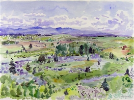
Rebecca Perehudoff
Rebecca Perehudoff, the oldest daughter of William Perehudoff and Dorothy Knowles. Although a long-time resident of Chicago, Illinois, Rebecca is still well known in the Canadian art scene. On a regular basis, she returns to paint from the Northern Saskatchewan forests and lakes near the family cabin at Emma Lake. There is a consistent lightness of touch in Rebecca’s work that comes from a familiarity with her subject and an inherent confidence and familiarity with the painting process. Rebecca has stated that “a connection with nature more than site per se is a wellspring for my art”.

and the brush strokes.
I love this work because the colours blend so well together but have bright splashes of green that compliment the others. I also love the scene she chose to paint. This picture is so simple but so complex at the same time. I can picture myself in a forrest like this and I can connect with the colours.
Patrick Jewell
The reason I am inspired and follow this man is self explanatory! His work is amazing and has a really great story as well.
"I'm a painter and a father, living and working in Brooklyn. If you knew me growing up in Toledo, you remember me as Packy. I post some images of my work on this blog, and write a little about my work and other things (e.g. art, movies, the Mets, fatherhood, life in the big city) from time to time. There are a couple links below where you can see more of my work-- at my website you'll find about 45 different images, and at my page on Picasa you can browse through several hundred more."
Patrick's painting above is a series of 3 paintings and are going to be displayed at LIU Brooklyn's Salena Gallery, March 5-30. I highly suggest taking a peek!
My own emotional labour?
Now what do you ask is the emotional labour I do myself? My labour is posting all my works of art to all my websites.
flicker
twitter
google+
carbonmade
This truly is the definition of emotional labour! Take a peek:

Carbonmade

Twitter

Google +

Flicker
My labour is just beginning, but here is what else is in store for me. Making the decision to step out of my shell and gain the attention. Be the person that won't take no for an answer, or hang up the phone as soon as the opportunity arrises. I'm going to take the opportunities that others won't.
Try emotional labour. It may seem like a lot of work, but its how you take your own future into your hand and make yourself known.
Take it from me, its not always easy, but in the end - I know I took every opportunity and ran with it.
Rachel.
Monday 12 March 2012
Rebecca Perehudoff
Rebecca Perehudoff (inspirational woman)
Rebecca Perehudoff, the oldest daughter of William Perehudoff and Dorothy Knowles. Although a long-time resident of Chicago, Illinois, Rebecca is still well known in the Canadian art scene. On a regular basis, she returns to paint from the Northern Saskatchewan forests and lakes near the family cabin at Emma Lake. There is a consistent lightness of touch in Rebecca’s work that comes from a familiarity with her subject and an inherent confidence and familiarity with the painting process. Rebecca has stated that “a connection with nature more than site per se is a wellspring for my art”.
This work of art created by Rebecca Perehudoff is
a really interesting piece because of the colours
and the brush strokes.
I love this work because the colours blend so well together but have bright splashes of green that compliment the others. I also love the scene she chose to paint. This picture is so simple but so complex at the same time. I can picture myself in a forrest like this and I can connect with the colours.
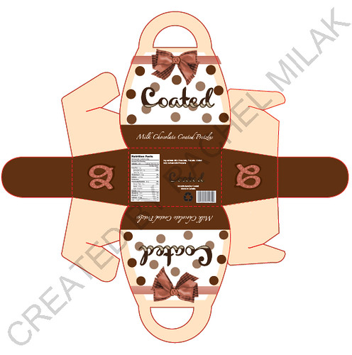
Chocolate Box Design
Hey Bloggers!
Just a quick message!! Check out this chocolate box design I've been working on! Its a box that turns almost into a purse and will hold delicious milk chocolate coated pretzels!
- Rachel
Just a quick message!! Check out this chocolate box design I've been working on! Its a box that turns almost into a purse and will hold delicious milk chocolate coated pretzels!
- Rachel
Tuesday 6 March 2012
Wine Bottle Labels
Hey Bloggers!
I've been branching out and trying new design and wanted to share with you some of my work. A local Wine company was looking for new labels to keep modern and fresh. One bottle is a "classic" look and one was a more "sexy" look. I thought long and hard about what each word meant and what would represent that in the best way possible.
Classic:
I started out thinking of a scene - not a photo realistic one - but a full out vector scene with a man and a woman. Many "classic" buyers are husbands/wives, boyfriend/girlfriend type buyers. Being a woman myself I tend to enjoy the "romantic" or "sweet" labels myself to keep as a memory. For my design I thought about a man and women silhouette standing very close and hiding something behind their backs. In the end I had the man hiding a wine bottle and the women hide a plate of cheese. I did this because wine and cheese go together - as well as a couple does. For the background I went with romantic Paris.

Sexy:
For the sexy bottle I really thought about what sexy is. To me - I believe sexy is a body. Now don't get a head of my yet! I chose a clothed body. Sexy is the beautiful lines of a body - each curve - every line. So I created a women's figure with a sexy gold dress. I didn't add many details to keep the mystery in the design. I also added blonde curly hair because many men love blondes. In the end I didn't finish the lines of her legs - just the beautiful curves. For a background I didn't put in one so that you could focus on her instead. Another aspect of the design was to add a word that is sexy. I chose "rondevu".

I hope you enjoyed my designs!
Cheers! Rachel.
Monday 5 March 2012
Capable
Hey Everyone! Another project I worked on was a new word of the week. This one is one of my favourites."Capable". I decided to go with an ad about capable and that anyone is capable of reaching their goals. With that - I went in the direction of reaching weight goals. Many men and women are joining gyms, eating healthier, and taking more healthy vitamins.

This image inspired me to do capable because it shows a beautiful women in a dress but states "part time wife". That just inspired me because shes capable of being a mom but also a fashion icon. Many moms are put into a category and have to stick to this, but this image shows she is capable of breaking the chains and being who she wants to be.

For my sketches I was torn between a tv ad, button, and poster advertisement. In the end I did a poster advertisement that could also be put onto a box. I thought about how to most effectively get out the advertisement. With women being such a "sexy" icon - I chose to show a healthy women's body. My only fear was that this may be seen as sexist or targeting only towards skinny women or men. When I did some research on that - I found out that many people are drawn to the image of "skinny" rather than male or female.
First I started off with an image of a women measuring her waist. I did this as a way to say "im capable of reaching my goal". I think this is a clean image that would help inspire people to reach any goals they set their minds to.


Next I added a "Start TODAY" and the "capable" slogan. I decided to add "start TODAY" to encourage people that this challenge is for anyone on any day. The slogan I chose was a way of saying that anyone and everyone is capable of reaching goals - be it weight or everyday challenges.

Next I created the Special K advertisement. I used the original Kellogg's logo to stay true to the product. Once I added the information I decided to make it into a challenge. I believe this would be a great add to place on a box, on the internet, on a card to send in the mail.
I hope you enjoyed my process of "Capable". Look in next week to see the new word of the week.
Cheers! Rachel.
Word Of The Week - Fluid
Hey guys. Sorry for the delay of posting - I had a week off and didn't have any internet. Since I had some time I did a few projects. So heres a new word of the week! "Fluid". I decided to be more creative and do a completely made up advertisement.


This image is by Al Parker and it really inspired my design this week. I chose this image because I loved how the bold colours jumped off the page and stuck in my mind. The colours flow together in a very effective way that is very striking.
My Sketches

My ideas instantly went to water and water products. I thought about water bottles and how I could make it better than any other bottle out on the market. After many sketches I came up with a self cleansing bottle so that you can use tap water but have it be safe and clean to drink.

First off I found bottles that are a striking colour and very interesting bottle. I chose these because its appealing to the eye and has a handle to hold on to. These bottles are also great because either gender would use these.
Next I created the title text. I liked the idea of having a letter drip at the end to emphasize "fluid". I changed the "L" to blue to add some dramatic difference, and to have a starting point for the drip. After that I added the main statement to the bottles. "hand held bottle filters".
Next I added a catchy phrase. "healthy hydration at your fingertips." I chose this statement because I wanted to emphasize the fact that the bottle filters itself.

And finally in the end I added a sponsor (2012 London Olympic Games) and the olympics logo. I believe this could be a great product for the olympics (if it were a real product).
Hope you enjoyed my thought process!
Rachel.
Tuesday 21 February 2012
Pay it Forward!
Hey everyone -
Just a quick blog! PAY IT FORWARD!
Share a random act of kindness and spread the news about
Pay it Forward Day - March 15th.
Check out the pay it forward blog @
payitforward.mohawkcollege.ca
Rachel.
Sunday 19 February 2012
Final International Women's Day Design
Hey Bloggers!
So here it is, the final design. I hope you got a good understanding on how I came to the final design and got inspired yourself.
To get from the painting to this, first I edited the colours to brighten them up, then all I did was take out all the text, add a fresh layer or photoshop paint, insert some new and interesting text, and add my own message.
Happy Long weekend!
Rachel.

Sunday 5 February 2012
Illustration Friday - " Suspense"
Hey bloggers!
So I got a head start on this week's word was SUSPENSE and I came up with a scary poster for Canada's Wonderland Halloween Haunt. I chose to do an advertisement for this because in my own experience, I was constantly in suspense wondering what was going to happen or jump out at me when I attended the Haunt this past october.


So I got a head start on this week's word was SUSPENSE and I came up with a scary poster for Canada's Wonderland Halloween Haunt. I chose to do an advertisement for this because in my own experience, I was constantly in suspense wondering what was going to happen or jump out at me when I attended the Haunt this past october.
Inspiration
This piece is by John Styga, and was my inspiration this week. I chose this piece because I likes how this shows a very scary image, but has the unrealistic quality I like. I also chose this one because this screams suspense. What's going to happen next? Does this man survive?

Sketch Work

For my sketches, I came up and several ideas on how to make this advertisement most effective. Some ideas went around centring out an item, some went around an theme or picture. In the end I chose to mix a picture and theme - zombies and graveyards.
How I Got To The Final
In the beginning I made a gradient for the background, a sunset to a dark night.
Next I added a small grave yard to add a scary appeal.

Then I added a few zombies to the yard for the "suspense" feel.

Up next I added a creepy zombie filled with blood and mystery. Then added the Canada's Wonderland Halloween Haunt logo.

To finish up I added the tag line and information.

In the end I ended up adding a few bats to add some more scary aspects for the grave yard.
I hope this added some suspense to the Halloween Haunt if you have never been.
Cheers! Rachel.
p.s check in next week for the new word of the week. :)
Thursday 2 February 2012
Illustration Friday "FORWARD"
Hey everyone!
So this week's word was "Forward". Thinking about the word made me think of a few options. Cars, technology, personal growth, and travel. This week I went with Cars because they are always changing and moving forward as people grow and change.


So this week's word was "Forward". Thinking about the word made me think of a few options. Cars, technology, personal growth, and travel. This week I went with Cars because they are always changing and moving forward as people grow and change.

My inspiration this week came from Thomas Vroman. I chose this piece because of its unrealistic quality. I liked how the colours aren't what you would normally pick, but it still makes a great picture. This is the way I chose to go with my picture.
Sketch Work

While I worked on what my concept should be, I thought about either doing a a road showing a car moving forward, a new car, or a view of a car. When I decided upon that, I chose to go with an advertisement for Bugatti Veyron 16.4 because it seems like a new step into technology.
Stages to the final

The first step was finding a proper photo and creating an unrealistic version of the car.

Next I added the smoke to the care to make it seem as if it were moving forward quickly.
Then I drew out the Bugatti Logo.

Next I added the name of the car and the specs on it.

In the end I added the slogan "always moving forward." to get the understanding of "forward".
Check in next week to see my next Illustration Friday's Word.
Cheers! Rachel.
Tuesday 24 January 2012
International Women's Day Painting Process - UPDATED!
Hey bloggers!
So I was really ambitious after my classes today and got a head start on my painting - couldn't be happier!!! I forgot how much I love painting! Anyways, back to the poster heres the break down.
What I've done:
- Painted the whole background yellow ( I chose yellow because its a variation of what skin looks like and I thought it would really bring in the pigments more clearly. Also the colour of the hair is almost white so I thought the yellow would help being in the highlights.)
-"LADYGAGA" in white. I chose to do her name in white because I will be doing a dark backdrop and my colour scheme centres around black, red, and white. I also chose this because I know it will really stand out once the backdrop is painted in.
- Lips and Nails. So as for the nails and lips I started these to get a feel for the paint and how it blends before I tackle the skin. I also did these now because the skin will come up around the lips and the fabric of her head dress comes around the nails.
(Images were originally in the post, but corrupted to the point that they had to be deleted - I apologize!)
Hey Everyone!! So got some work done and here it is up til nearly finished!
So this stage was adding the eyes and final touches on the lips. The blue was really interesting to do in here eyes.
Next, I added the background - I think the black really makes the name stand out. It also should make Lady Gaga and her head dress show up.
Next I started with the first layer of skin - nice and light.
Then slowly adding some highlight and shadows. This stage took many turns and twists because I kept changing light sources.
Finally after getting the skin to where I wanted it, I moved on to the face. This was a fun stage!
After the face came doing the base for the hair. It's interesting how the yellow from the very first stage almost made its own highlights.
After the base yellowed hair came the highlights. I tried to make it look as natural as possible. And I added the eye lashes now that the skin was where I wanted it.
When I finally got the hair to the shades I liked, the head dress needed to be started. I mixed two different reds to create the highlight and lowlights of it.
Next came the darkening of the shadows and folds of the material.
And finally, here's where I am now. I added some more highlights and shadows to the head dress and added a few more features to the skin. The major thing was I added "International Women's Day 2012" as a tattoo on her arm to signify who she really is.
So a few more things to fix up and add, but I'm nearly done!
Hope you got a little insight as to how I did it. And yes, I will answer the question many have been asking - as of now - I have been working on this painting for just under 20 hours. But every hours been worth it!
Come back soon and see the finished piece!
Cheers - Rachel

Here it is - the final art work!
In the end I added more shading to the skin on the face and arms, changed the tattoo to a more realistic look, and adapted the lips. Hope you enjoyed the process as much as I did.
Saturday 21 January 2012
Challenge: 3 "Twirl"
Hey Bloggers!! So week 3 of illustration friday's challenge was the word "Twirl". When I saw the word it took me a few minutes to think of a really good advertisement for that word. When I thought long and hard about the word twirl, dance came into mind.


Inspiration for the week

This picture is by Will Davies and is my inspiration for this week. I chose this specific picture because of the colours. The sepia and the dark blacks and grey's are an interesting combination and I thought it would be a great idea for a Dance Studio advertisement.
Sketches
(Sorry they are kind of hard to see)

As for sketching ideas .. that was tricky!! I had a million and a half ideas on how to do this. New shapes for advertisements, silhouettes, couples, and the list goes on. As for my final decisions I chose to go with a girl or a silhouette. I chose between these two because I find them elegant and very recognizable in the dance world. My sketches show some with multiple pictures of types of dance, backgrounds, and some just the dancer. After the sketches came the choice of how to do the final. I chose the last sketch based upon a picture I came upon online.
Final
Background: First I chose the size and shape of the ad and went with a long thin canvas and added a grey backdrop to make the outer boarder.

Picture: Next I added the picture that inspired my dance studio ad. I love this picture because its beautiful, soft, and this girl has beautiful body lines. The photographer who took this photo is now my idol in my mind! This photo also happened to be in my colour range!

Twirl: To add twirl I made it the studio's name. Since dance is a mixture of twirls and movements I thought it suited a studio very well. I added the silhouette because I believe it is a major icon and is very memorable!

Final: In the end I added the things that the studio included such as classes, teams, couple classes (like a wedding dance maybe or just for fun) and a kids camp for an after school program. I also added that it is a new studio and to register now.
I really love how this ad turned out. The elegance of the photo I tried to bring into the actual advertisement by using the same text throughout but adding a tag line of cursive font. I also like the small addition of the red to the information, I believe it stands out but isn't throwing off the balance.
Please leave any and all comments!
Happy Blogging! Check in next week to see challenge 4!
*The photo used was not my own and all credit goes to this amazing photographer!*
Subscribe to:
Posts (Atom)