" What is emotional Labour? It's difficult work that other people don't feel like doing" - Seth Gordin
Hey Bloggers, Im writing today to talk to you about Emotional Labour and what it means - not only in theory - but what it means to me as well.
When designers break into the business you never fully understand how much labour is involved just to get started. Its time consuming, tiring, and very scary. To be a great designer you have to put yourselves out there - all of yourself- and show what your really capable of. There is a great pod cast by Seth Gordin about his views on what emotional labour is. ( I fully suggest listening to it - it has some great tips: http://www.cbc.ca/spark/2010/01/spark-97-january-3-5-2010/) Seth talks about how you have to be the person that wants attention and to be noticed, and to someone like me, its a scary thought. Were taught at a young age that being selfish isn't a good trait to have - but in the graphics world you need to have an attitude like that. Its not really about being selfish - but about having the quality of wanting to be known and remembered.
" The most precious thing to have is attention" - Seth Gordin
In the graphics world I found out that to get attention you have to really go out on a limb and go viral. You put that emotional labour into making something of yourself. You create blogs, flicker accounts, google +, twitter, facebook and many more websites to get your name out there. When I first heard of this it made me wonder, "well how will anyone actually find me? I've never done anything before." I realized that once one person see's what you can do - they share it - anyone else who see's it may like it and share it as well - and the chain keeps moving. Now this isn't only for graphics - anyone who just thinks "wow thats cool" can share it too. By posting what you do - I found out that people in other countries have seen what I am capable of. This whole network is all about emotional labour. Putting in that extra 10 minuets of your day, even when you really don't want to, to (not really brag) but to say "hey, what do you think" can go a very long way!
"If no one knows your ideas - they are worthless" - Seth Gordin
When I heard that statement in his podcast I was taken off guard. I thought "How can he say that? Does that mean that if I don't share them, I think they aren't good enough?" When I kept listening I realized that he didn't mean that your ideas are bad because you don't say them - but that you may miss out on a great opportunity if you don't say anything. Being in graphic design - I fully understand how heart wrenching it can be when people say your ideas are bad, and you internally think "I'm just not going to say anything else so I don't look foolish."But I also fully understand that to be someone in the graphics world - I have to put my idea's out there and know that there will be some really bad ideas - but once in a while - really great ones comes around too.
Being a young designer, the emotional labour is just beginning for me. I have long days filled with endless amounts of work to do and by 11 pm, the last thing I want to do is come to my computer again and write about what I do. I constantly have this battle with myself thinking "why bother?" until the next day when I see that someone actually looked at it. They may not leave a comment, but I know I succeeded, even in a tiny way, because I got my name out.
"The future belongs to those who take initiative" - Seth Gordin
As an example of initiative - what you're reading is a great example, my blog. I do my best to post details of my projects in a step by step post and try to get you involved in the process. On my blog I post artist who inspire me such as Mike Barr (http://artofbarr.blogspot.com/?expref=next-blog), and Patrick Jewell (http://patrickjewell.blogspot.com/?expref=next-blog) down the side of my blog.
Mike Barr
Mike Barr is an Australian painter who inspired me a lot and has a really great story.
"My first artistic milestone was takiing part a group exhibition when I was only 18 years of age. It was not as a painter however, but a potter. After a large break were I dabbled every few years or so in oils and watercolours, I started in earnest about 7 years ago in acrylics. Since that time I have aquired over 40 awards and have works in collections around the world. I have written feature articles both in Australia and the UK. Beaches and moody rainy-day streets are my favourite subjects, probably because I enjoy the effects of shadow, light and reflection. Joy of Place is what I wish to share. There is enough, darkness, ugliness and works that are confusing and distressing. I vote for joy, beauty and breathtaking."
Mike is a great blogger to follow because of how he not only posts about himself - but other images, cool topics, and resources.
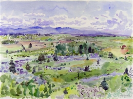
Rebecca Perehudoff, the oldest daughter of William Perehudoff and Dorothy Knowles. Although a long-time resident of Chicago, Illinois, Rebecca is still well known in the Canadian art scene. On a regular basis, she returns to paint from the Northern Saskatchewan forests and lakes near the family cabin at Emma Lake. There is a consistent lightness of touch in Rebecca’s work that comes from a familiarity with her subject and an inherent confidence and familiarity with the painting process. Rebecca has stated that “a connection with nature more than site per se is a wellspring for my art”.
This work of art created by Rebecca Perehudoff is a really interesting piece because of the colours
and the brush strokes.
I love this work because the colours blend so well together but have bright splashes of green that compliment the others. I also love the scene she chose to paint. This picture is so simple but so complex at the same time. I can picture myself in a forrest like this and I can connect with the colours.
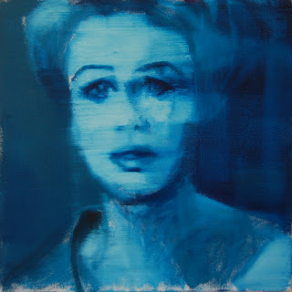
Patrick Jewell
The reason I am inspired and follow this man is self explanatory! His work is amazing and has a really great story as well.
"I'm a painter and a father, living and working in Brooklyn. If you knew me growing up in Toledo, you remember me as Packy. I post some images of my work on this blog, and write a little about my work and other things (e.g. art, movies, the Mets, fatherhood, life in the big city) from time to time. There are a couple links below where you can see more of my work-- at my website you'll find about 45 different images, and at my page on Picasa you can browse through several hundred more."
Patrick's painting above is a series of 3 paintings and are going to be displayed at LIU Brooklyn's Salena Gallery, March 5-30. I highly suggest taking a peek!
My own emotional labour?
Now what do you ask is the emotional labour I do myself? My labour is posting all my works of art to all my websites.
flicker
twitter
google+
carbonmade
This truly is the definition of emotional labour! Take a peek:
Carbonmade
Twitter
Google +
Flicker
My labour is just beginning, but here is what else is in store for me. Making the decision to step out of my shell and gain the attention. Be the person that won't take no for an answer, or hang up the phone as soon as the opportunity arrises. I'm going to take the opportunities that others won't.
Try emotional labour. It may seem like a lot of work, but its how you take your own future into your hand and make yourself known.
Take it from me, its not always easy, but in the end - I know I took every opportunity and ran with it.
Rachel.


