Hey Bloggers!
Just a quick message!! Check out this chocolate box design I've been working on! Its a box that turns almost into a purse and will hold delicious milk chocolate coated pretzels!
- Rachel

Rachel Milak - Graphic Designer
Monday, 12 March 2012


Tuesday, 6 March 2012
Wine Bottle Labels
Hey Bloggers!
I've been branching out and trying new design and wanted to share with you some of my work. A local Wine company was looking for new labels to keep modern and fresh. One bottle is a "classic" look and one was a more "sexy" look. I thought long and hard about what each word meant and what would represent that in the best way possible.
Classic:
I started out thinking of a scene - not a photo realistic one - but a full out vector scene with a man and a woman. Many "classic" buyers are husbands/wives, boyfriend/girlfriend type buyers. Being a woman myself I tend to enjoy the "romantic" or "sweet" labels myself to keep as a memory. For my design I thought about a man and women silhouette standing very close and hiding something behind their backs. In the end I had the man hiding a wine bottle and the women hide a plate of cheese. I did this because wine and cheese go together - as well as a couple does. For the background I went with romantic Paris.

Sexy:
For the sexy bottle I really thought about what sexy is. To me - I believe sexy is a body. Now don't get a head of my yet! I chose a clothed body. Sexy is the beautiful lines of a body - each curve - every line. So I created a women's figure with a sexy gold dress. I didn't add many details to keep the mystery in the design. I also added blonde curly hair because many men love blondes. In the end I didn't finish the lines of her legs - just the beautiful curves. For a background I didn't put in one so that you could focus on her instead. Another aspect of the design was to add a word that is sexy. I chose "rondevu".

I hope you enjoyed my designs!
Cheers! Rachel.
Monday, 5 March 2012
Capable
Hey Everyone! Another project I worked on was a new word of the week. This one is one of my favourites."Capable". I decided to go with an ad about capable and that anyone is capable of reaching their goals. With that - I went in the direction of reaching weight goals. Many men and women are joining gyms, eating healthier, and taking more healthy vitamins.

This image inspired me to do capable because it shows a beautiful women in a dress but states "part time wife". That just inspired me because shes capable of being a mom but also a fashion icon. Many moms are put into a category and have to stick to this, but this image shows she is capable of breaking the chains and being who she wants to be.

For my sketches I was torn between a tv ad, button, and poster advertisement. In the end I did a poster advertisement that could also be put onto a box. I thought about how to most effectively get out the advertisement. With women being such a "sexy" icon - I chose to show a healthy women's body. My only fear was that this may be seen as sexist or targeting only towards skinny women or men. When I did some research on that - I found out that many people are drawn to the image of "skinny" rather than male or female.
First I started off with an image of a women measuring her waist. I did this as a way to say "im capable of reaching my goal". I think this is a clean image that would help inspire people to reach any goals they set their minds to.


Next I added a "Start TODAY" and the "capable" slogan. I decided to add "start TODAY" to encourage people that this challenge is for anyone on any day. The slogan I chose was a way of saying that anyone and everyone is capable of reaching goals - be it weight or everyday challenges.

Next I created the Special K advertisement. I used the original Kellogg's logo to stay true to the product. Once I added the information I decided to make it into a challenge. I believe this would be a great add to place on a box, on the internet, on a card to send in the mail.
I hope you enjoyed my process of "Capable". Look in next week to see the new word of the week.
Cheers! Rachel.
Word Of The Week - Fluid
Hey guys. Sorry for the delay of posting - I had a week off and didn't have any internet. Since I had some time I did a few projects. So heres a new word of the week! "Fluid". I decided to be more creative and do a completely made up advertisement.


This image is by Al Parker and it really inspired my design this week. I chose this image because I loved how the bold colours jumped off the page and stuck in my mind. The colours flow together in a very effective way that is very striking.
My Sketches

My ideas instantly went to water and water products. I thought about water bottles and how I could make it better than any other bottle out on the market. After many sketches I came up with a self cleansing bottle so that you can use tap water but have it be safe and clean to drink.

First off I found bottles that are a striking colour and very interesting bottle. I chose these because its appealing to the eye and has a handle to hold on to. These bottles are also great because either gender would use these.
Next I created the title text. I liked the idea of having a letter drip at the end to emphasize "fluid". I changed the "L" to blue to add some dramatic difference, and to have a starting point for the drip. After that I added the main statement to the bottles. "hand held bottle filters".
Next I added a catchy phrase. "healthy hydration at your fingertips." I chose this statement because I wanted to emphasize the fact that the bottle filters itself.

And finally in the end I added a sponsor (2012 London Olympic Games) and the olympics logo. I believe this could be a great product for the olympics (if it were a real product).
Hope you enjoyed my thought process!
Rachel.
Tuesday, 21 February 2012
Pay it Forward!
Hey everyone -
Just a quick blog! PAY IT FORWARD!
Share a random act of kindness and spread the news about
Pay it Forward Day - March 15th.
Check out the pay it forward blog @
payitforward.mohawkcollege.ca
Rachel.
Sunday, 19 February 2012
Final International Women's Day Design
Hey Bloggers!
So here it is, the final design. I hope you got a good understanding on how I came to the final design and got inspired yourself.
To get from the painting to this, first I edited the colours to brighten them up, then all I did was take out all the text, add a fresh layer or photoshop paint, insert some new and interesting text, and add my own message.
Happy Long weekend!
Rachel.

Sunday, 5 February 2012
Illustration Friday - " Suspense"
Hey bloggers!
So I got a head start on this week's word was SUSPENSE and I came up with a scary poster for Canada's Wonderland Halloween Haunt. I chose to do an advertisement for this because in my own experience, I was constantly in suspense wondering what was going to happen or jump out at me when I attended the Haunt this past october.


So I got a head start on this week's word was SUSPENSE and I came up with a scary poster for Canada's Wonderland Halloween Haunt. I chose to do an advertisement for this because in my own experience, I was constantly in suspense wondering what was going to happen or jump out at me when I attended the Haunt this past october.
Inspiration
This piece is by John Styga, and was my inspiration this week. I chose this piece because I likes how this shows a very scary image, but has the unrealistic quality I like. I also chose this one because this screams suspense. What's going to happen next? Does this man survive?

Sketch Work

For my sketches, I came up and several ideas on how to make this advertisement most effective. Some ideas went around centring out an item, some went around an theme or picture. In the end I chose to mix a picture and theme - zombies and graveyards.
How I Got To The Final
In the beginning I made a gradient for the background, a sunset to a dark night.
Next I added a small grave yard to add a scary appeal.

Then I added a few zombies to the yard for the "suspense" feel.

Up next I added a creepy zombie filled with blood and mystery. Then added the Canada's Wonderland Halloween Haunt logo.

To finish up I added the tag line and information.
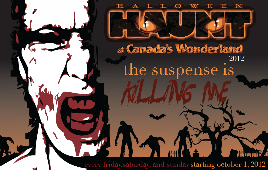
In the end I ended up adding a few bats to add some more scary aspects for the grave yard.
I hope this added some suspense to the Halloween Haunt if you have never been.
Cheers! Rachel.
p.s check in next week for the new word of the week. :)
Subscribe to:
Posts (Atom)